The summer of 2014 held an unforgettable event for the lovers of Matisse, one of the masters of 20th century visual arts. The Tate Modern in London offered an unprecedented exhibition of Matisse’s cut-outs, the art form he created and developed in the last decade of his life, after undergoing a very invasive and traumatic operation for intestinal cancer in the early 1940s. This exhibition, Matisse: the Cut-Outs, showed nothing less than 130 pieces of Matisse’s works, a unique feat that some claim won’t be repeated in the foreseeable future.
Matisse’s cut-outs are deceptively simple compositions made of shapes cut out from sheets of paper painted in vibrant gouache colors and assembled together as a collage in somewhat abstract forms. After his surgery, Matisse found it difficult to stand at the easel and paint for long hours, so he decided to start experimenting with this radically novel art form. Sitting on his bed or in a wheelchair, he would dexterously cut shapes directly from the sheets of paper with huge tailor scissors, and then ask his assistants to pin them together in a variety of patterns. He changed the arrangements many times before he was fully satisfied with the overall look and effect of the piece.
Matisse’s cut-outs are revolutionary in the sense that they broke the barriers between drawing and painting fusing them in enchanting colorful shapes. Each cut-out was directly sliced from the colorful sheet without a previous penciled outline to help define the form. They are basically a celebration of color and an affirmation of life. Many considered this new artistic phase of Matisse his second life. A rebirth in every sense.
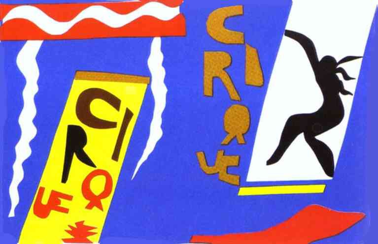
The Circus, 1947. Illustration for the book Jazz.
The first cut-outs appeared in a limited edition book called Jazz, which, in addition to the 20 screen printed cutouts, featured Matisse’s handwritten notes about the images, painted in black.The contrast between his beautiful monochromatic handwriting against the white paper and the fierce colors of the screen printed cut-outs creates a striking effect. In this book, a copy of which is kept at the Victoria and Albert Museum in London, the cut-cuts are mainly representations of circus performers, such as high wire walkers, trapeze artists, acrobats, clowns, knife-throwers and magicians.
Despite its vibrant colors, some identify a darker side to this book, though. Produced at the end of the Second World War, it’s not difficult to read metaphors of these violent and disruptive times into it. Take the iconic Icarus below, for example. You might see it as a representation of the mythological figure of the son of Daedalus plunging across the sky to his death, having flown too close to the sun, which caused his wax wings to melt down. Or you can see a corpse in the middle of exploding shells with a bloody spot right over his heart, as a clear reference to the war.

Icarus. 1947. Illustration for the book Jazz.
Matisse did not stop painting altogether as he started creating the cut-outs. Some of his most amazing paintings date from this period as well. However, after 1948, maybe because of his progressive frailty and growing infirmity, he practically gave up on painting. His creative force, therefore, was channeled to the cut-outs, which began growing in size, becoming murals, and totally capturing the artist’s imagination, becoming almost an obsession.
At first sight, some people may be taken aback by the simplicity of this art form, and some even dare to say this is something even a kid could do. Well, we defy them to try it. Only an artist of the scope of Matisse would be able to combine those kinds of colors and variety of shapes to produce such an impactful and pleasurable effect on the viewer. Besides, the best ideas, as we know, are usually the simplest ones: only nobody thought about them before. Copy cats abound afterwards in all areas of life.

The Snail. 1952/53.
No discussion about Matisse’s cut-outs would be complete without mentioning his final masterpiece: the design of the Chapel of the Rosary in Vence, built just down the road from the bucolic house – Villa Le Rêve – where Matisse lived in the last years of his life. It took Matisse four years to complete the project, which included stained-glass windows, three ceramic murals, the interior decorations and even the priest’s robes.
The chapel is famous for the atmosphere of serenity it infuses in its visitors. His maquettes for the stained-glass windows were assemblages of cut-outs, in soothing hues of green, blue and yellow. As the sunlight filters through them, reflecting on the marble floor, one notices the three ceramic murals opposite them, bearing monochromatic drawings representing in utter simplicity and some audacity (such as emphasizing the breasts of the Virgin Mary), the Virgin Mary with Baby Jesus, the Stations of the Cross, and the founder of the order of the Dominicans, Saint Dominic.
Matisse was known for his atheism, which makes many wonder what prompted him to design this chapel and to consider it himself his greatest achievement as an artist. One reason might be he did it after becoming close friends with a Dominican nun, Sister Jacques-Marie, who nursed him during his period of convalescence after the surgery. Her convent did not have a chapel at the time, forcing the nuns to use an old garage for their rituals. Matisse used to say that he felt God only when he was working. Therefore, the chapel is more likely to be an expression of his devotion to the God of Art, using motifs of the Christian religion only as metaphors.

Interior of the Chapel of the Rosary in Vince. 1950.
NOTE: You might want to check out our series of eBooks available from AMAZON.COM TEACHING ENGLISH WITH ART. Please click here: http://wp.me/p4gEKJ-1lS

Teaching English with Art
Au revoir
Jorge Sette.